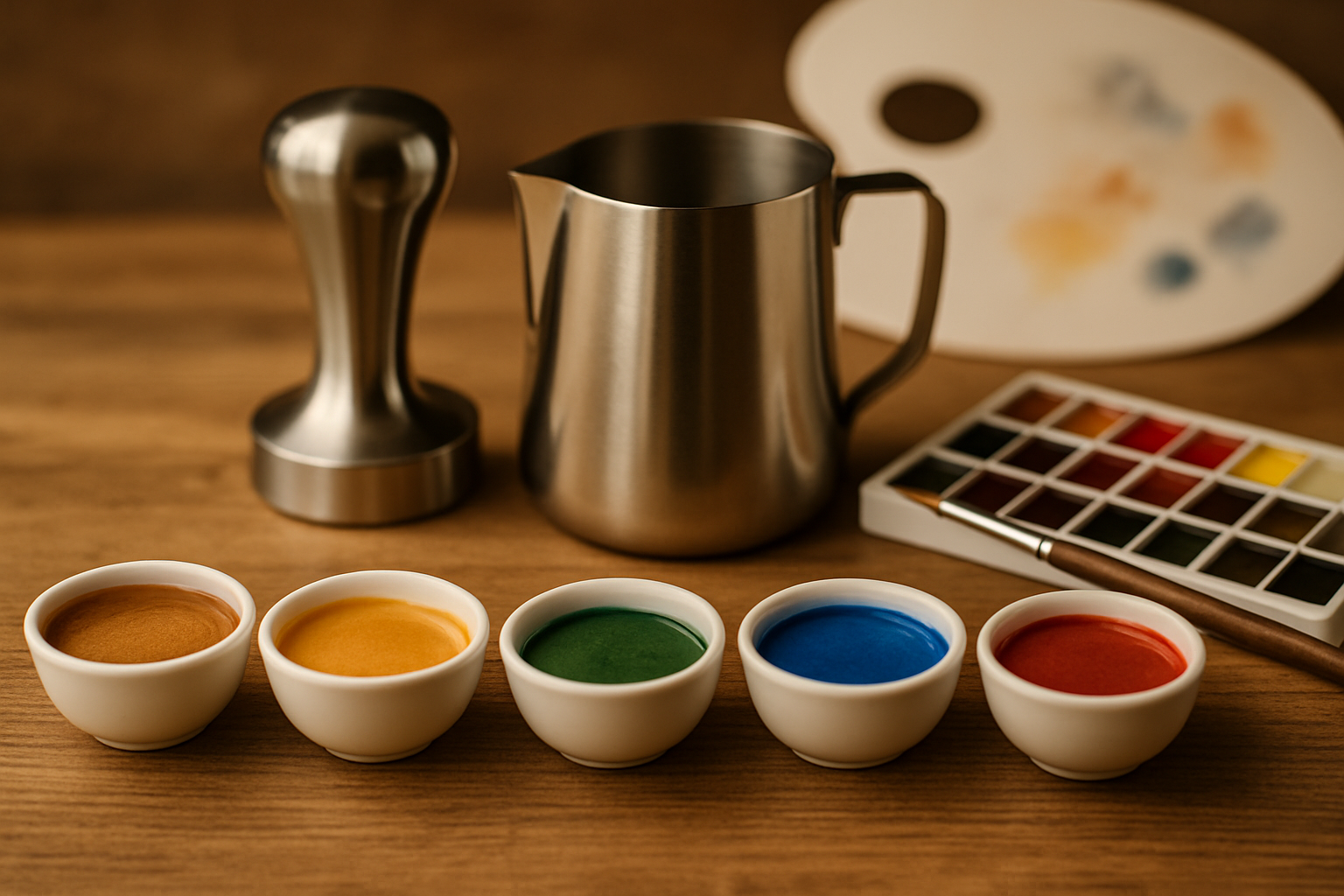
When we think of barista skills, we often focus on taste, temperature, or latte art. But one of the most underrated — and most powerful — tools in a barista’s creative arsenal is visual design.
Just like painters, baristas work with color, contrast, texture, and composition. They don’t use oils or acrylics. Their medium is espresso crema, microfoam, and carefully chosen serveware.
In today’s specialty coffee scene, how a drink looks is as important as how it tastes. A visually harmonious drink invites anticipation, sets expectations, and even alters perceived flavor.
In this article, we’ll explore how the principles of color theory, visual texture, and artistic balance apply to barista craft. You’ll learn how to see coffee like an artist — and create drinks that look as good as they taste.
The Psychology of Visual Presentation
Before a customer takes a sip, they’ve already formed an impression. This impression is visual. Studies show that we taste with our eyes first. When a drink looks intentional and beautiful, we expect it to be delicious — and that expectation shapes our experience.
This isn’t just a bonus. Visual harmony can:
- Enhance perceived sweetness
- Improve customer satisfaction
- Increase shareability on social media
- Set your café apart from competitors
The visual experience of a drink becomes part of its story — and your brand’s identity.
Color in Coffee: More Than Brown
At first glance, coffee is just… brown. But for a trained barista, it’s a full palette. The crema on an espresso shot can range from golden amber to rich mahogany. Milk foam adds whites, beiges, and light browns. Chocolate, matcha, and fruit syrups introduce color variation.
Understanding color means observing these subtle shifts and using them deliberately. Examples:
- Pairing a bright green matcha latte with a matte black cup to enhance contrast
- Choosing a blue saucer to make latte art pop
- Using a transparent glass to showcase the layering of a macchiato
Color choices influence how clean, warm, sweet, or intense a drink appears. A cappuccino in a red cup feels bolder than the same drink in white porcelain.
The Role of Contrast
Contrast creates focus. In visual design, contrast between light and dark elements draws the eye. The same applies to coffee.
In latte art, high contrast between milk and crema makes designs pop. This starts with milk texturing — the shinier and denser the foam, the whiter the pattern. It continues with the espresso base — the richer the crema, the darker the canvas.
Tips to maximize contrast:
- Use fresh beans and consistent dosing for stable crema
- Steam milk with care for velvety microfoam
- Choose cup colors that complement your milk tones
Even black coffee benefits from contrast — serve in white cups to highlight clarity and color depth.
Texture as a Visual Element
Texture is often thought of as mouthfeel — and yes, that matters. But texture is also visual. Shiny vs. matte, smooth vs. bubbly, dense vs. airy — these qualities influence how drinks are perceived before tasting.
Perfect microfoam has a glossy, wet-paint finish. It suggests quality and craftsmanship. A bubbly or dry foam looks careless, even if the drink tastes fine.
Visual texture also appears in:
- Cold foam with ripples or swirls
- Iced drinks with layered gradients
- Shakeratos with crema froth
- Espresso shots with tiger-striping
Training your eye to notice texture is key. A well-textured drink looks intentional — a visual invitation to sip.
The Cup as Canvas
Your drink is only part of the composition. The cup, saucer, and even the spoon contribute to the overall visual experience.
When choosing serveware, consider:
- Shape: Tulip cups enhance latte art symmetry
- Color: Neutrals (white, gray) offer contrast; bold colors evoke mood
- Finish: Matte gives a modern look; glossy reads as classic
- Material: Ceramic holds heat and lends tradition; glass offers transparency and layering
Baristas often overlook how powerful a good cup is. But the right serveware doesn’t just hold coffee — it frames it.
Composition and Balance
Baristas may not think of themselves as designers, but composition is everything. Where your latte art sits in the cup, how full the cup is, the ratio of crema to milk — it all affects harmony.
Common design rules include:
- Center your pour unless intentionally off-center
- Leave just enough headspace (3–5mm) for visual breathing room
- Ensure symmetrical pours for hearts, tulips, and rosettas
- Align latte art with the handle for aesthetic and ergonomic flow
Some baristas also experiment with asymmetry, diagonal pours, or free-form patterns. These should still feel balanced — like visual jazz, not visual chaos.
Color Psychology in Café Design
The color choices behind the bar matter too. Think about what colors your tools, towels, and counters communicate:
- Black and chrome feel professional and sleek
- Wood and white create warmth and simplicity
- Bright colors add energy, but can distract if overdone
Consistency between the café environment and drink presentation creates a holistic experience. Customers may not notice consciously, but they feel it.
Signature Visual Style
Great cafés — and baristas — often develop a visual signature. This doesn’t mean repeating the same art. It means having a style.
Do you favor symmetry or wild pours? Earth tones or neon? Matte black cups or transparent glasses?
Your visual signature becomes part of your identity. Customers remember how your drinks looked — not just how they tasted.
To develop your style:
- Take photos of your drinks and review them weekly
- Follow visual artists for inspiration (not just coffee creators)
- Explore color palettes and plating from fine dining
- Notice what patterns emerge in your choices — and lean into them
Latte Art as Language
Latte art isn’t just decoration — it communicates. A perfect rosetta says, “I care.” A freestyle wave says, “I’m creative.” A seasonal design, like a pumpkin or snowflake, says, “I pay attention to detail.”
Baristas can use this language to:
- Express mood
- Reflect the season
- Engage customers
- Build personal connection
Customers may not know the terms, but they respond to the effort. A personalized pour for a regular — even a smiley face — builds loyalty more than any discount.
Visual Creativity Beyond Latte Art
While latte art gets the spotlight, visual design applies to:
- Cold drinks: Layered iced lattes, matcha over milk, or nitro textures
- Signature drinks: Use garnishes, syrups, or sauces to decorate
- Dessert pairings: Consider plate composition like a chef
- Seasonal drinks: Use color themes and edible decorations
Think like a designer, not just a drink maker. Each cup is a chance to create.
Training Your Eye: Exercises for Baristas
Want to improve your visual harmony? Practice like an artist.
- Take a photo of every drink you make for one week. Review for consistency and style.
- Sketch your latte art before pouring. It builds muscle memory and visual planning.
- Create a mood board with drink colors, cup inspiration, and plating ideas.
- Use limited palettes: One day use only white cups. Another, only black. See how color changes perception.
- Study other crafts: Follow ceramicists, painters, bakers. Look at how they use balance, contrast, and form.
Your eye is a tool. Train it like your hands.
Visual Identity and Social Media
We live in a visual world. Instagram, TikTok, and Pinterest have turned baristas into content creators. This can feel overwhelming — but it’s also a gift.
Your drink’s appearance can:
- Attract new customers
- Inspire others in the industry
- Showcase your creativity
- Build your personal or café brand
Photography tips for baristas:
- Use natural light if possible
- Shoot from above (flat lay) or at a 45° angle for best results
- Keep backgrounds simple — let the drink shine
- Edit lightly for clarity and consistency
You don’t need a fancy camera. A sharp eye and consistent style are more powerful.
Final Thoughts: See Like an Artist
Being a great barista isn’t just about what you taste — it’s about what you see.
Your hands create drinks. Your eyes guide them. And your creativity brings them to life.
When you begin to think like an artist — using color, contrast, texture, and form — your drinks become more than beverages. They become experiences. They tell stories. They connect.
So next time you steam milk or pull a shot, don’t just ask, “Does this taste good?” Ask, “How does this look? How does it feel? What am I saying with this cup?”
Because in the world of specialty coffee, presentation isn’t optional. It’s part of the craft.

Marcelo Oliveira is a coffee enthusiast and content creator specializing in barista skills, brewing methods, equipment reviews, coffee-related health insights, and fascinating curiosities from the coffee world. With a deep passion for every step of the brewing process, he turns technical knowledge into accessible and engaging content for both beginners and seasoned coffee lovers. Marcelo’s goal is to help readers appreciate the full experience of coffee—from bean to cup.
